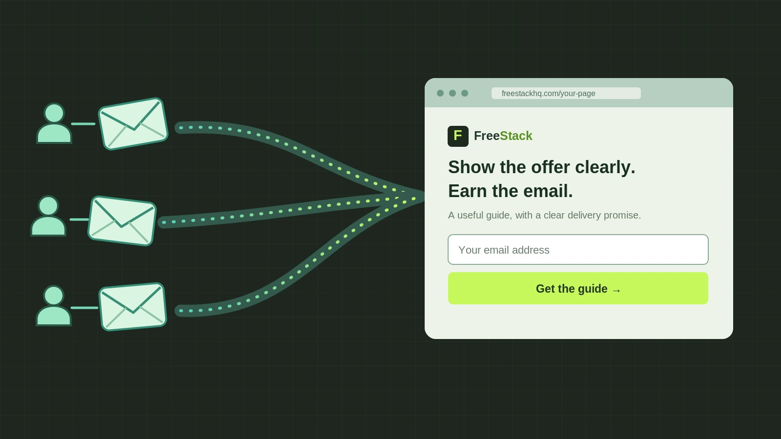
Start with the right measure, not a magic conversion target
Write down the goal before you choose a template: “a new visitor receives the promised file after submitting a valid email.” Track unique landing-page visitors, valid submissions, and successful deliveries separately. Submission rate = valid submissions ÷ unique visitors. Delivery rate = confirmed deliveries ÷ valid submissions. These are reporting definitions for this guide, not published study statistics. A click or a contact row is not proof that the file arrived.
For context, Unbounce’s 2024 report found a 6.6% median conversion rate across its landing pages, using 41,000-plus pages, 464 million unique visitors and 57 million conversions from July 2023 to July 2024 [1]. It mixes industries and conversion actions; it is not a target for your PDF page. Compare your own baseline by traffic source and device, then improve from there.
Decide whether the download is worth an email address
Describe the asset before asking for an address. Offer a preview: a page, an example, the table of contents, or a plain list of what the download solves. If the same information is freely available everywhere, consider giving it away without a gate. If the file saves work or contains unique value, explain that exchange clearly.
Nielsen Norman Group’s research on gated content says early-stage visitors may abandon intrusive forms, while useful, distinctive material gives them a reason to continue [2]. Write a concrete promise: “Get the 7-day equipment-free workout PDF” beats “Unlock exclusive content.” State file type, when it arrives, and whether signing up also means marketing email. Do not bury the second purpose in a vague button.
Make the headline, page and button say the same thing
Use the same offer language in the link or ad, the landing-page headline, and the button. A person promised a workout PDF should not land on a generic “wellness journey” page. Put the outcome and intended reader up front, then answer the two likely objections: what is in it and what does it cost?
Replace a vague “Get started” with an action that predicts the next step, such as “Email me the workout PDF.” NN/g found that generic CTA labels can mislead people into unexpected signup flows [4]; its information-scent guidance says link text and destination should match what a visitor expects [5]. This is a clarity test, not a claim that a particular button color or wording lifts conversions by a fixed amount.
Build a form people can finish and trust
For a file sent by email, begin with an email field and add another question only if delivery truly needs it. Keep labels visible, put the fields in one column, and make validation errors specific. NN/g’s 2025 EAS method is “Eliminate, Automate, Simplify,” not “always use exactly one field” [12]. In a form-usability study cited by NN/g in 2016, 78% of people completed guideline-compliant forms without an error on the first try versus 42% for forms that violated the guidelines [3]. That endpoint is error-free completion, not landing-page conversion.
If you have genuine customer permission, place a specific testimonial or relevant proof near the form. If you do not, show a real excerpt of the file or a credible creator identity instead. Never make up quotes or counters: the FTC’s 2024 rule prohibits fake or false consumer testimonials in its US scope [7]. Keep the consent line and privacy link clear rather than claiming that a trust badge by itself will fix the form.
Check the page on a phone and keep it quick
Use a real phone-width preview. Check that the headline, field, consent text and button fit without sideways scrolling, and that keyboard entry and errors work. Compress a heavy hero image and measure the resulting mobile page, not just its desktop design.
A Google/Deloitte study published in 2020 looked at more than 30 million sessions across 37 brands. For lead-generation journeys, a 0.1-second improvement across four measured speed metrics was associated with 21.6% more users progressing from the first form step to the submission page [6]. The study observed existing sites in 2019; it does not mean one new page or one image edit will earn a 21.6% lift. Use speed as a testable constraint, not a promise.
Wire the delivery, then test the whole path
Create an opt-in page, a clear after-submit confirmation, and one reliable way to get the file: a working download link on the confirmation page, an email with a file link, or both. Say which one you chose before the visitor submits. In any builder, check what action the form button actually performs; in Systeme.io, the documented Build an Audience funnel includes opt-in and thank-you steps [9], and its email automation needs the form button set to Submit form [10]. Those are example mechanics, not the only way to build this page.
Submit an address you control on desktop and phone. Verify the correct thank-you page, that the download opens, and that a promised email arrives with the right file. Test the failure path too: a mistyped email, a broken file link, and a delayed message. Only then send traffic. Keep counts for visits, submissions and deliveries apart so a broken delivery does not masquerade as a successful signup.
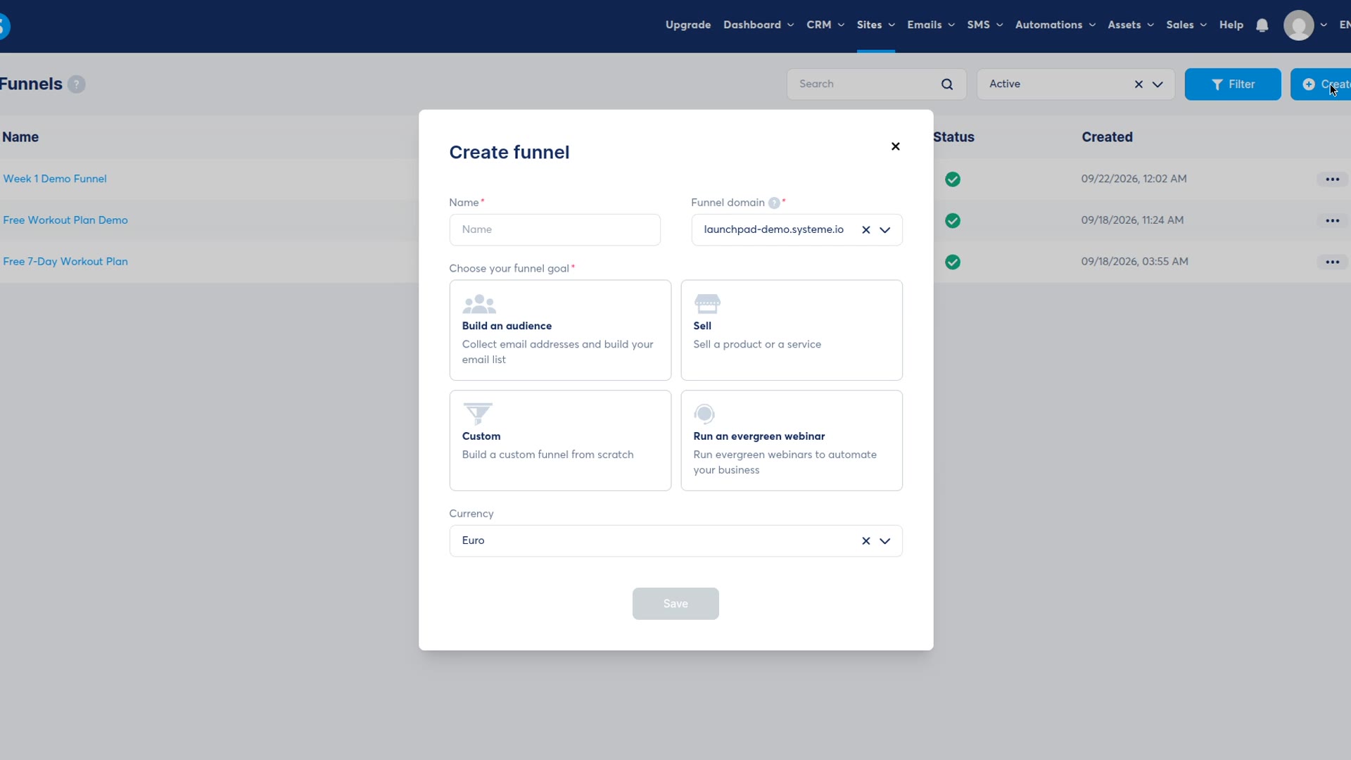
Our actual setup recording: the Build an audience option, before the page was complete.
Our worked example, and how to improve yours
For our Systeme.io free-plan test, we chose a 7-day equipment-free workout PDF. The finished opt-in page says what the file contains and asks for an email beside one submit button. The separate funnel-builder capture shows the “Build an audience” choice. Our hands-on review records the free-plan limits and original test [11]. These are real page and setup images; neither shows an email inbox or a conversion-rate experiment.
Start with one baseline. If people see the page but do not submit, test a clearer promise or a less demanding form. If they submit but do not receive the asset, fix delivery before changing the headline. Change one meaningful element at a time and keep the traffic source comparable. NN/g’s 2024 A/B testing guide recommends choosing the outcome and required sample size in advance, changing one design element per variant, and running at least one to two weeks when a properly powered test is possible [8]. It warns that low-traffic pages are often a poor fit for A/B tests. If your traffic is too small for a fair A/B test, use direct user feedback and a working end-to-end checklist rather than declaring a “winner” from a handful of signups.
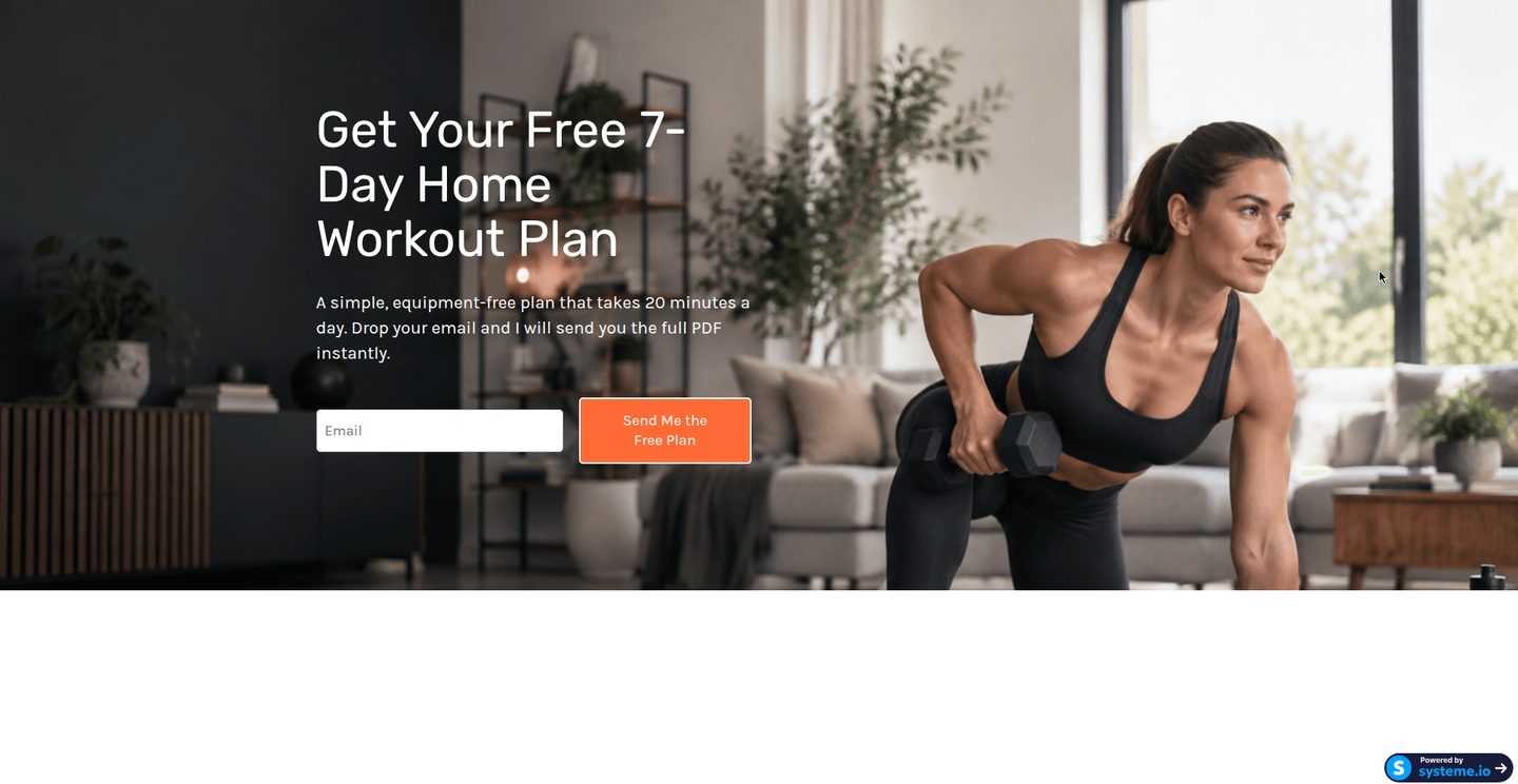
Our actual test page. It demonstrates offer and form, not measured conversion or delivery.